About the Artist
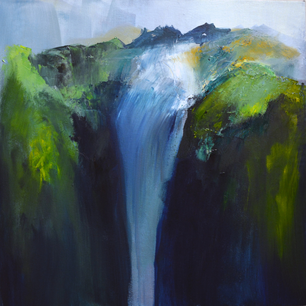
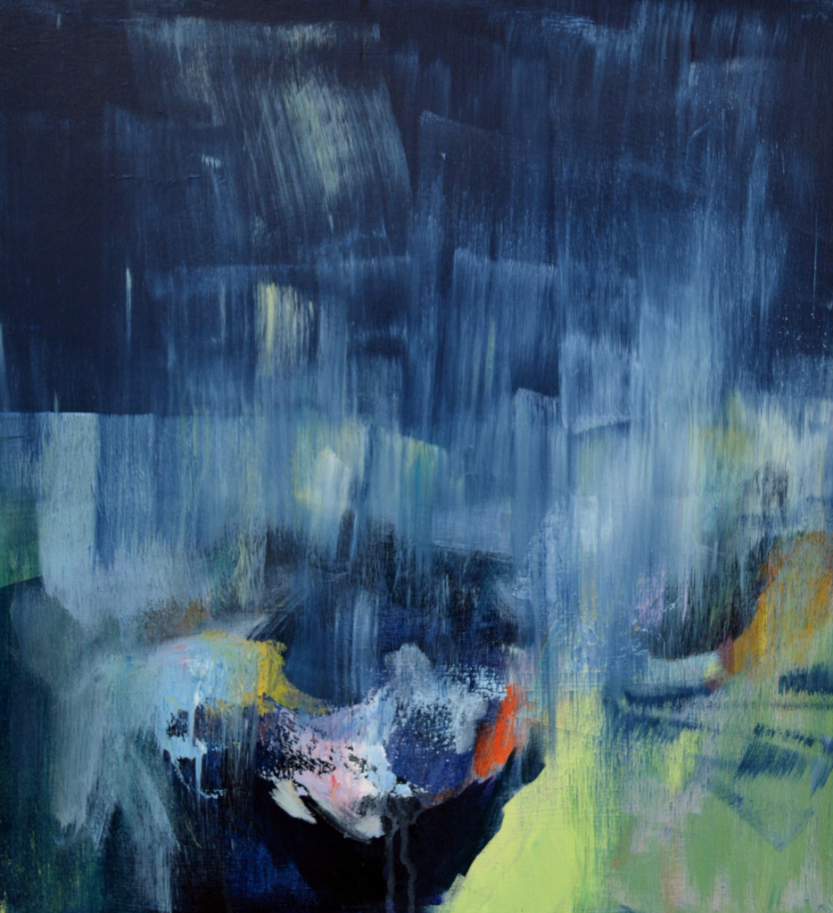
Betsy Ruth Byers describes her oil abstraction Wolverine “as about light, movement, and the malleable edges between land and water. I am enraptured by both its softness and its contrasting moments of concreteness. It beckons me to break through its edge and walk within, in a moment of becoming.” In contrast, she chose Point of No Return “because it was memorable to make. My body intuitively understood what moves to make next in order to translate the falling of water. I felt near feverish moving the oil with brushes, sponges, rags, and trowels. I can still hear the rushing sound of water as it drops into the canyon when I look at this work. Can you?”
Kate Casanova selected two small, biomorphic sculptures for Artists’ Favorites. She chose Untitled 23 for its “grotesque and comical composition. I find inhabiting a body to be an absurd experience and this piece speaks to me about the unruliness of bodies.” In Untitled 24, she adds, “the relationship between the two objects is quite visceral. This piece mimics how bodies form and are formed by their physical surroundings.”
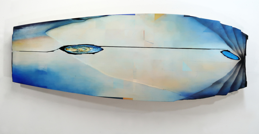
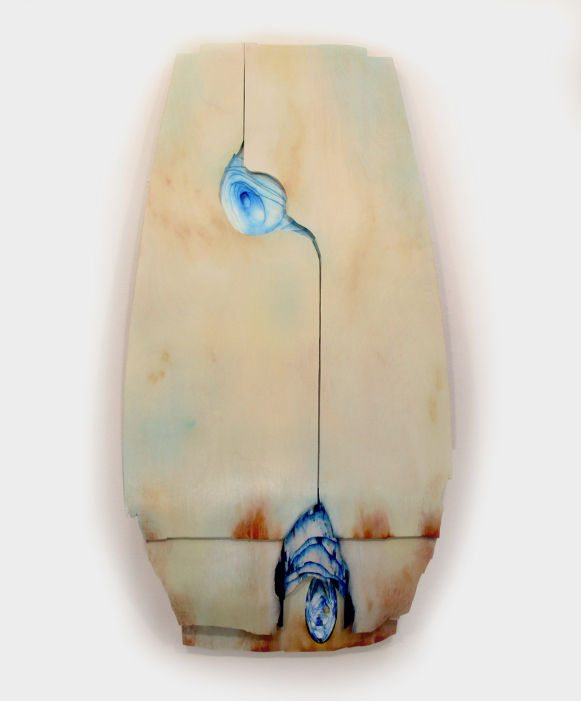
Jil Evans, who works in oil, says her selections for Artists’ Favorites “correspond to the two poles of feeling I have right now, of intimacy and of vast space, which fits the tension I feel inside: the pull to venture inward toward quiet, and the pull to be in the world as an agent of change.”
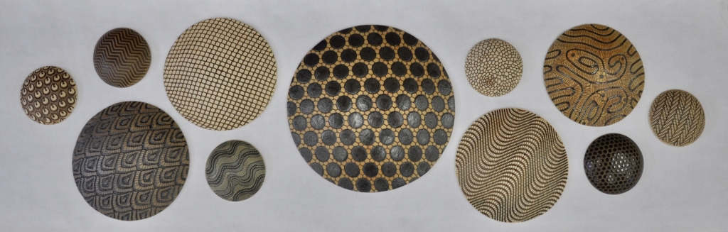
Kelly Jean Ohl likes her hand carved, clay disc installation because the “round shapes bring me such joy. They’re compositionally looser and more playful than some of my other installation work.” Conversely, her collection of heavily carved, hand-held rattles,” she adds, “are personal sensory experiences. You can look at, pick up, and shake each piece, enjoying their pattern, texture, and sound. I like having the rattles alongside an installation piece.”
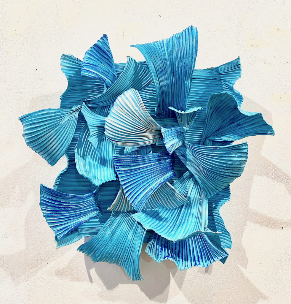
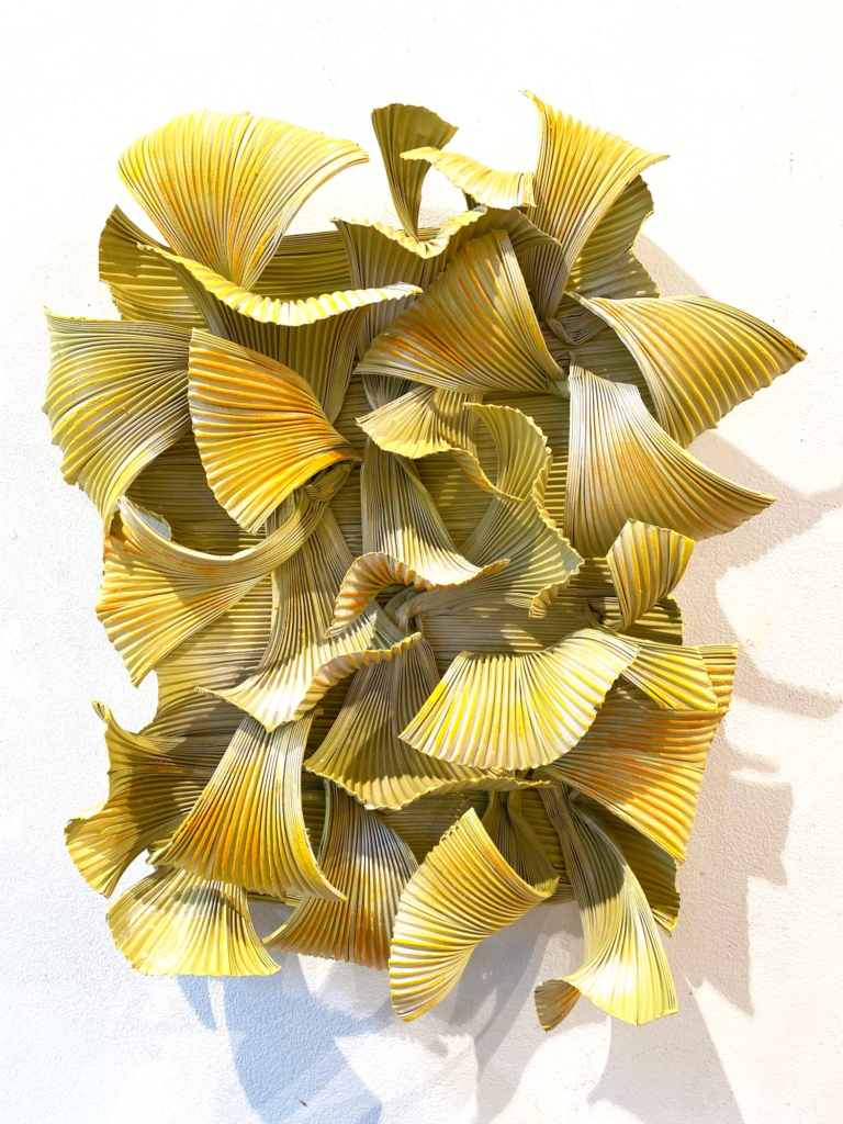
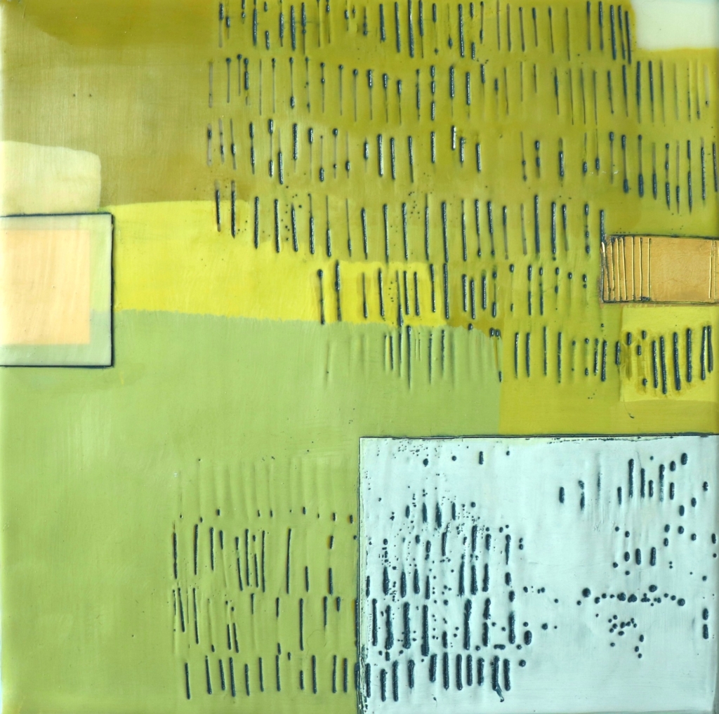
Jodi Reeb chose two new sculptures from her new series of encaustic paint on primed aluminum sheeting. She is particularly partial to Into the Blue and Sunny Dispositions because “their bright colors speak to summer’s sunshine and blue skies in Minnesota”
Julie Snidle selected, Hope, “because the quiet conversation between text, line, shape, and the soft palette of this often-overlooked painting is a calm and reassuring message.” Conversely, The Race is On, she adds, speaks not to the political moment, but was chosen “for its nostalgic expression, within its spaciousness, of the freedom we long for.”
Cameron Zebrun’s large-scale sculptures evoke “the rivers and watercourses along the North Shore of Lake Superior, and their accompanying geological features, waterfalls, and cauldrons,” he says. They also “represent my interest in creating objects of fine craftsmanship and illustrate my preoccupation with presenting landscape subject matter in surprising and non-traditional ways.”
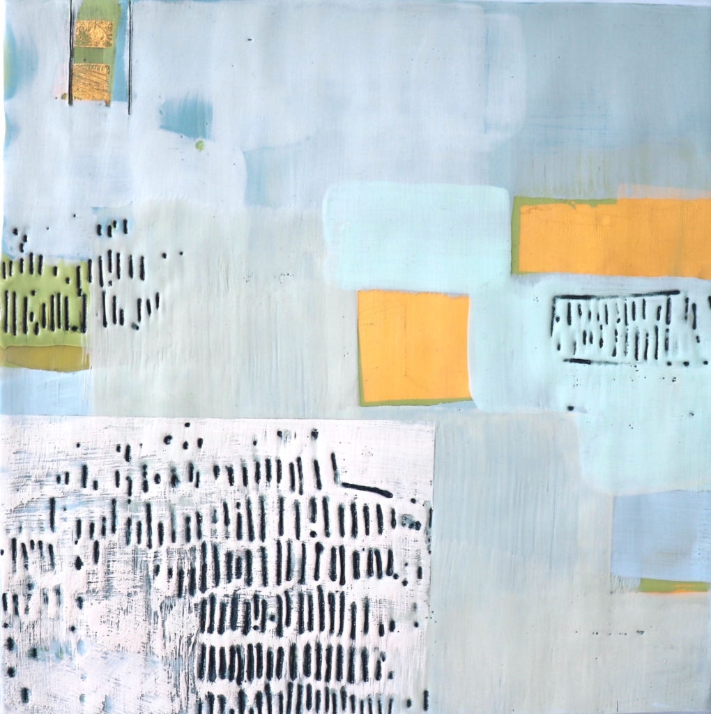
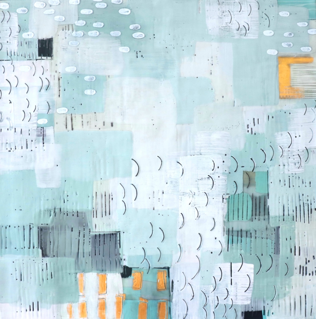
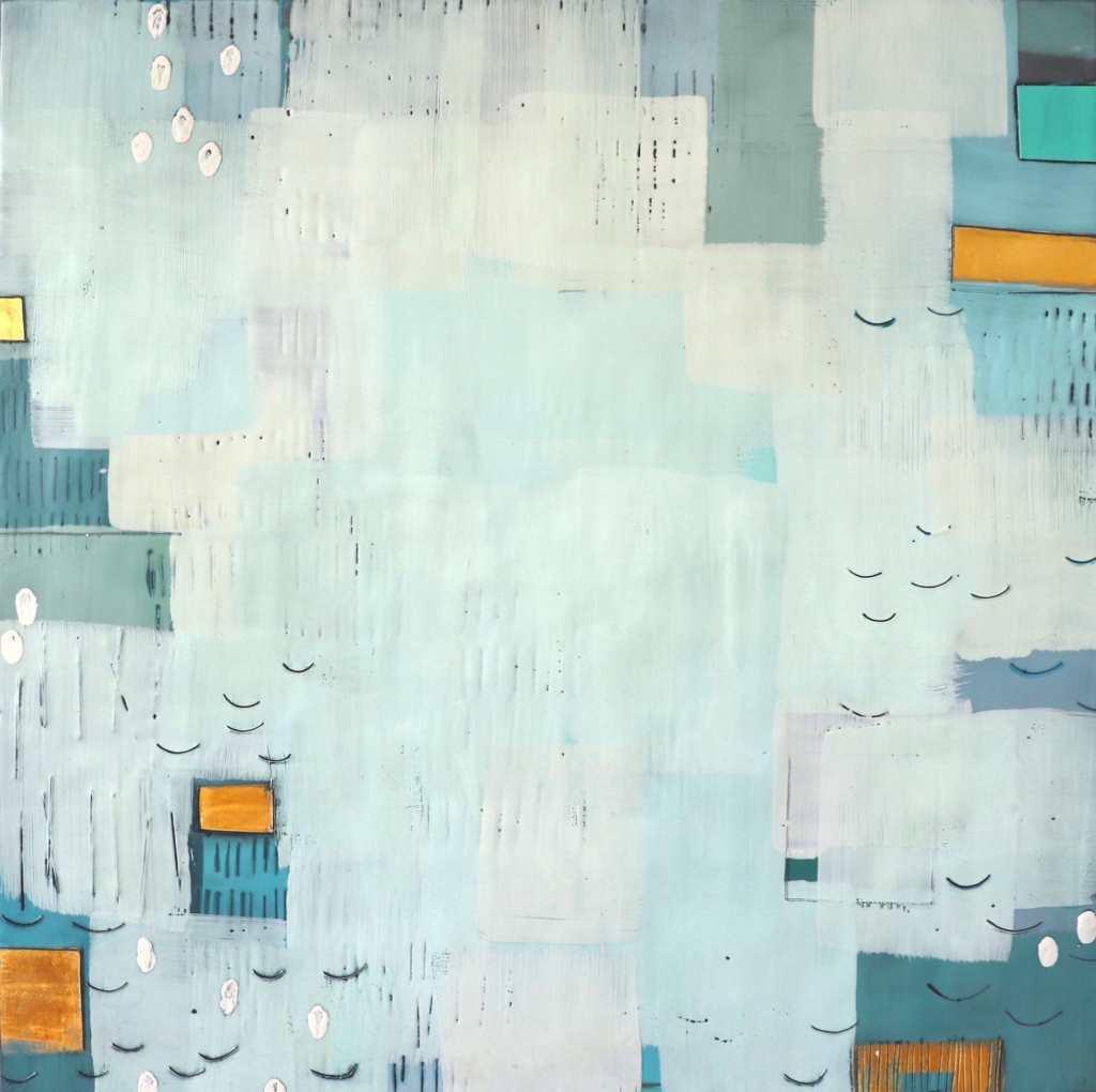
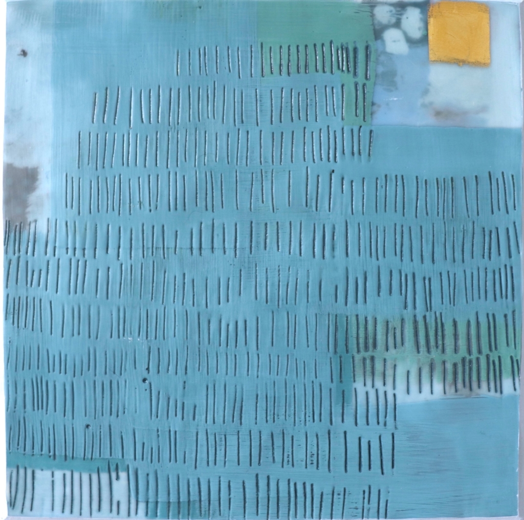
Dietlind Vander Schaaf’s five encaustic, oil, and gold-leaf pieces represent “just enough color, just enough emptiness and space, and just enough marks to allow for movement in the work. I’m always striving for a sense of calm centeredness in my work; the feeling you might get from a great yoga class or a walk in the woods.”